
1. 标签分类:
按照特性,对HTML标签进行分类:
按照类型可以划分为:
a. block 块 div, p, ul, li h1,h2, ....h6....
特性:独占一行;支持所有样式;不设置width的时候,跟父元素的宽度一样;所占区域是一个矩形
b. inline 内联 span, a, em, strong, img....
特性:不独占一行,而是挨在一起;有些样式不支持;不写宽度的时候,宽度由内容决定;所占区域不一定是矩形
c. inline-block 内联块 input, select...
特性:即具备块的特性,也具备内联的特性。
2.按内容划分标签:
按内容划分:
Flow: 流内容,表示网页当中能够感知到的一些标签,比如,标题,块...
Metadata: 元数据,例如设置网页中的编码,一部分能够感知到,另一部分属于辅助功能,不能感知到
Section: 分区,例如div标签
Heading: 表示标题, h1,h2....h6
Phrasing: 措辞,即对文本的修饰,例如strong, em
Embedded: 嵌入的,例如图片就是,audio, video
Interactive:互动的,如输入框,下拉菜单
3.display显示框类型:
display的属性值:
block
inline
inline-block
none: 让标签不在页面进行任何显示
<!DOCTYPE html>
<html lang="en">
<head>
    <meta charset="UTF-8">
    <title>Title</title>
    <style>
        div{
            width: 100px;
            height: 100px;
            background-color: red;
            display: inline;         /*改变标签的display属性*/
        }
    </style>
</head>
<body>
    <div id="box1">block1</div>
    <div id="box2">block2</div>
</body>
</html>
display:none与visibility:hidden的区别:
display:none不占空间的隐藏,但是visibility:hidden虽然会隐藏标签,但是会占空间。
4. 标签嵌套规范:
ul/ol, li
dl, dt, dd
table, tr, td
块标签可以嵌套内联标签
块标签不一定能嵌套块标签
内联标签不能嵌套块标签
5. 溢出隐藏
overflow的属性值(用于控制内容溢出块的大小的时候,显示的情况) overflow-x, overflow-y针对两个轴分别设置
visible: 默认 (溢出的内容可见)
hidden:(溢出的内容隐藏)
scroll: 出现滚动条(x,y方向均有)
auto: 当内特溢出的时候出现滚动条,不溢出的时候没有滚动条
在默认值下,overflow的默认值为visibility:
<!DOCTYPE html>
<html lang="en">
<head>
    <meta charset="UTF-8">
    <title>Title</title>
    <style>
        div{
            width: 200px;
            height: 200px;
            border: solid black 2px;
        }
    </style>
</head>
<body>
    <div>
        溢出隐藏 溢出隐藏 溢出隐藏 溢出隐藏
        溢出隐藏 溢出隐藏 溢出隐藏 溢出隐藏
        溢出隐藏 溢出隐藏 溢出隐藏 溢出隐藏
        溢出隐藏 溢出隐藏 溢出隐藏 溢出隐藏
        溢出隐藏 溢出隐藏 溢出隐藏 溢出隐藏
        溢出隐藏 溢出隐藏 溢出隐藏 溢出隐藏
        溢出隐藏 溢出隐藏 溢出隐藏 溢出隐藏
        溢出隐藏 溢出隐藏 溢出隐藏 溢出隐藏
        溢出隐藏 溢出隐藏 溢出隐藏 溢出隐藏
    </div>
</body>
</html>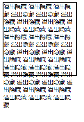

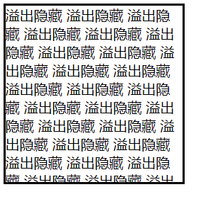
overflow的值为hidden时:
6.透明度与手势:
opacity: 0~1 透明~不透明, 块是半透明的,所有的子内容也会变化,成为半透明。
要实现子内容的不变,需要使用rgba, rgba可以让指定的样式透明,而不影响其他的样式。
cursor: 手势,当鼠标放到某些内容上时,所呈现的图标
default: 默认是箭头,常用的还有pointer, move, help, 还可以实现自定义的图标
<!DOCTYPE html>
<html lang="en">
<head>
    <meta charset="UTF-8">
    <title>Title</title>
    <style>
        #box1{
            width: 200px;
            height: 200px;
            border: solid black 2px;
            /*background-color: red;*/
            /*opacity: 0.5;*/
            background-color: rgba(255, 0, 0, 0.5);
        }
        #box2{
            width: 100px;
            height: 100px;
            background-color: red;
            cursor: pointer;      /*手型图标*/
        }
        #box3{
            width: 100px;
            height: 100px;
            background-color: red;
            cursor: move;        /*十字形图标*/
        }
        #box4{
            width: 100px;
            height: 100px;
            background-color: red;
            cursor: help;
        }
    </style>
</head>
<body>
    <div id="box1">
        This is a block
    </div>
    <div id="box2"></div>
    <div id="box3"></div>
    <div id="box4"></div>
</body>
</html>
7. 最大最小宽高:
min-width, max-width
min-height, max-height
当内容较少的时候,块的大小会根据内容的多少进行自适应变化,块的尺寸最大不会超过max-width, max-height
<!DOCTYPE html>
<html lang="en">
<head>
    <meta charset="UTF-8">
    <title>Title</title>
    <style>
        #box1{
            width: 200px;
            max-height: 200px;
            border: solid black 2px;
            background-color: red;
        }
    </style>
</head>
<body>
    <div id="box1">
        This is a block
    </div>
</body>
</html>
% 单位, 是以父容器的大小进行换算
css默认样式:
HTML中部分标签是带有默认样式的,一些是没有默认样式的。
没有默认样式:例如 div, span
有默认样式的:body, p, h1, li
CSS样式重置:
将一些标签的默认样式进行重置
在开始的时候,使用通配符:
* {margin: 0; padding: 0} , 但是会稍微影响性能。
或者将具有默认样式的标签单独进行重置操作:
body, p, h1, ul {margin:0, padding: 0}
ul {list-style:none}, a{text-decoration: none}, img { display: block}
写页面或者一个具体的效果的时候,具体的步骤是:
1. 写结构 (html)
2. 进行CSS重置样式
3. 写具体的样式
关于样式的重置可以参考博客,有现成的CSS文件可用
练习写一个简单的结构:
<!DOCTYPE html>
<html lang="en">
<head>
    <meta charset="UTF-8">
    <title>Title</title>
    <style>
        /*重置样式*/
        *
        {
            margin: 0;
            padding: 0;
        }
        ul{list-style: none;}        /*去掉列表前面的点*/
        img{display: block;}         /**/
        a{text-decoration: none; color: gray}     /*a链接下不出现下划线*/
        h1,h2,h3,h4,h5,h6
        {
            font-size: 16px;
            font-weight: normal;
        }

        /*开始设置样式*/
        #container
        {
            margin: 20px auto;
            width: 238px;
            border: #666666 solid 1px;
            border-top: 3px solid #ff8400;
        }
        #container div a img
        {
            width: 200px;
            height: 160px;
        }
        #container h2
        {
            line-height: 35px;
            padding-left: 11px;
        }
        #container h2 a
        {
            color: black;
        }
        #container h2 a:hover
        {
            color: #ff8400;
        }

        #container div img
        {
            margin-left: auto;
            margin-right: auto;
            margin-top: 8px;
            margin-bottom: 5px;
        }

        #container ul
        {
            font-size: 12px;
            line-height: 24px;
        }

        #container ul li
        {
            padding: 8px;
        }
        #container ul li.first-line
        {
            border-top: 2px gray solid;
        }

        #container ul a:hover
        {
            color: #ff8400;
            text-decoration: underline;
        }
    </style>
</head>
<body>
    <div id="container">
        <h2>
            <a href="#">探索趣图</a>
        </h2>
        <div>
            <a>
                <img src="../picture/map.jpg" alt="">
            </a>
        </div>
        <ul>
            <li class="first-line">
                <a href="#">测试文字测试文字</a>
            </li>
            <li>
                <a href="#">测试文字测试文字</a>
            </li>
            <li>
                <a href="#">测试文字测试文字</a>
            </li>
        </ul>
    </div>
</body>
</html>
8. float浮动概念及原理:
文档流:文档流是文档中可显示对象在排列时所占用的位置,即在写完html结构,结构默认的排列方式,叫做文档流。block(块) 在文档流中的默认排列方式是从上到下,in-line(内联)在文档流中的默认排列方式是从左到右。
float特性:可以脱离文档流,即不再按照默认的排列方式去排列。加浮动的元素,会沿着父容器靠左或者靠右排列,如果之前已经有浮动的元素,则会挨着浮动的元素进行排列。
float取值: left, right, none(默认)
元素浮动起来之后,就不再占用原来的位置
<!DOCTYPE html>
<html lang="en">
<head>
    <meta charset="UTF-8">
    <title>Title</title>
    <style>
        body{
            border: black solid 2px;
        }
       #box1{
           width: 100px;
           height: 100px;
           background-color: red;
           float: left;
       }
       #box2 {
           width: 200px;
           height: 200px;
           background-color: blue;
           float: left;
       }
    </style>
</head>
<body>
    <div id="box1"></div>
    <div id="box2"></div>
</body>
</html>
float注意点:
1. 只会影响后面的元素
2. 内容默认提升半层
3. 默认宽根据内容决定
4. 换行排列;
5. 主要给块元素添加,也可以给内联元素添加
清除float浮动:
如果不希望float影响后面元素的布局,则需要清除float.
如何清除浮动:
上下排列: clear属性,表示清除浮动, clear可选值,left, right , both
<!DOCTYPE html>
<html lang="en">
<head>
    <meta charset="UTF-8">
    <title>Title</title>
    <style>
       #box1{
           width: 100px;
           height: 100px;
           background-color: red;
           float: left;        /*元素浮动*/
       }
       #box2 {
           width: 200px;
           height: 200px;
           background-color: blue;
           clear: left;        /*清除上面元素的浮动,使得BOX2不受影响*/
       }
    </style>
</head>
<body>
    <div id="box1"></div>
    <div id="box2"></div>
</body>
</html>
嵌套排列清除浮动:
通过after伪类的方式清除浮动 (clear属性只会操作块标签,对内联标签不起作用)
<!DOCTYPE html>
<html lang="en">
<head>
    <meta charset="UTF-8">
    <title>Title</title>
    <style>
       #box1{
           width: 200px;
           border: 1px solid black;
       }
       #box2 {
           width: 100px;
           height: 200px;
           background-color: blue;
           float: left;
       }

        .clear:after{
            content: "";
            display: block;
            clear: both;
        }
       /*因为after伪类添加的内容是内联样式,但是clear是针对块的,所以需要使用display转换成块*/
    </style>
</head>
<body>
    <div id="box1" class="clear">
        <div id="box2"></div>
    </div>
    aaaaa
</body>
</html>
利用浮动实现布局效果:
<!DOCTYPE html>
<html lang="en">
<head>
<meta charset="UTF-8">
<title>Title</title>
<style>
/*去掉默认样式*/
*{
margin: 0;
padding: 0;
}
ul{
list-style: none;
}
img{
display: block;
}
a{
text-decoration: none;
color: grey;
}
h1,h2,h3{
font-size: 16px;
}
.l{
float: left;
}
.r{
float: right;
}
.clear:after{
content: "";
display: block;
clear: both;
}
#main{
width: 366px;
margin: 20px auto;
}
#main .title{
height: 23px;
line-height: 23px;
font-size: 12px;
font-weight: bold;
padding-left: 30px;
/*background: aqua url("../picture/sun.gif") no-repeat;*/
background: aqua;
}
#main .pic{
width: 99px;
border: 1px solid #c8c4d3;
}
#main .pic img{
margin: auto;
}
#main .content{
width: 240px;
margin-left: 13px;
}
#main .content h2{
font-size: 12px;
font-weight: bold;
line-height: 24px;
}
#main .content p{
font-size: 12px;
line-height: 20px;
}
#main ul{
overflow: hidden;
margin-top: 13px;
}
#main li{
margin-bottom: 22px;
}
#main{
background-color: aliceblue;
}
</style>
</head>
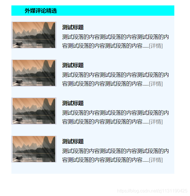
<body>
<div id="main">
<h2 class="title">外媒评论精选</h2>
<ul>
<li class="clear">
<div class="pic l">
<a href="#">
<img alt="" src="../picture/timg1.jpg" width="96px" height="58px">
</a>
</div>
<div class="content l">
<h2>测试标题</h2>
<p>测试段落的内容测试段落的内容测试段落的内容测试段落的内容测试段落的内容.....<a href="#">[详情]</a></p>
</div>
</li>
<li class="clear">
<div class="pic l">
<a href="#">
<img alt="" src="../picture/timg1.jpg" width="96px" height="58px">
</a>
</div>
<div class="content l">
<h2>测试标题</h2>
<p>测试段落的内容测试段落的内容测试段落的内容测试段落的内容测试段落的内容.....<a href="#">[详情]</a></p>
</div>
</li>
<li class="clear">
<div class="pic l">
<a href="#">
<img alt="" src="../picture/timg1.jpg" width="96px" height="58px">
</a>
</div>
<div class="content l">
<h2>测试标题</h2>
<p>测试段落的内容测试段落的内容测试段落的内容测试段落的内容测试段落的内容.....<a href="#">[详情]</a></p>
</div>
</li>
<li class="clear">
<div class="pic l">
<a href="#">
<img alt="" src="../picture/timg1.jpg" width="96px" height="58px">
</a>
</div>
<div class="content l">
<h2>测试标题</h2>
<p>测试段落的内容测试段落的内容测试段落的内容测试段落的内容测试段落的内容.....<a href="#">[详情]</a></p>
</div>
</li>
</ul>
</div>
</body>
</html>实际效果:
------------------------------------------------------------------------------------------------------
relative相对定位:
position定位: css position用于指定一个元素在文档中的定位方式,top, right, bottom, left则决定了该元素的最终位置。
注:浮动适合做左右布局,定位比较适合做叠加的布局。
position取值:static, relative, absolute, fixed, sticky
relative使用:
1. 如果没有定位偏移量,对元素本身没有任何影响
2. 不使元素脱离文档流
3. 不影响其他元素布局
4.left,top,right,bottom是相对于当前元素自身进行偏移。
<!DOCTYPE html>
<html lang="en">
<head>
    <meta charset="UTF-8">
    <title>Title</title>
    <style>
        #box1{
            width: 100px;
            height: 100px;
            background: aqua;
        }
        #box2{
            width: 100px;
            height: 100px;
            background: red;
            position: relative;
            left: 100px;
            top: 100px;
        }
        #box3{
            width: 100px;
            height: 100px;
            background: black;
        }
    </style>
</head>
<body>
    <div id="box1"></div>
    <div id="box2"></div>
    <div id="box3"></div>
</body>
</html>
absolute决定定位:
position: absolute
1. 使元素完全脱离文档流
2. 使内联元素支持宽高(让内联具备块属性)
3. 使块元素默认根据内容决定(让块元素具备内联的特性)
4. 如果有定位祖先元素相对于定位祖先元素发生偏移,没有定位祖先元素相对于整个文档发生偏移(绝对,相对,固定)
<!DOCTYPE html>
<html lang="en">
<head>
    <meta charset="UTF-8">
    <title>Title</title>
    <style>
        #box1{
            width: 100px;
            height: 100px;
            background: aqua;
            position: absolute;
            left: 50px;
            top: 50px;
        }
        #box2{
            width: 200px;
            height: 200px;
            background: red;
            position: absolute;
            left: 150px;
            top: 200px;
        }
        span{
            width: 50px;
            height: 30px;
            position: absolute;
        }
    </style>
</head>
<body>
    <div id="box1"></div>
    <div id="box2"></div>
    <span>内联元素</span>
</body>
</html>
只有在祖先元素有定位的时候(relative, absolute,fixed),子元素才会在absolute定位下相对于祖先元素进行偏移。否则相对于浏览器的原点进行偏移。
<!DOCTYPE html>
<html lang="en">
<head>
    <meta charset="UTF-8">
    <title>Title</title>
    <style>
        #box1{
            width: 200px;
            height: 200px;
            border: black solid 1px;
            margin: 200px;
            position: absolute;    /*祖先元素有定位*/
        }
        #box2{
            width: 50px;
            height: 50px;
            background: red;
            position: absolute;
            left: 30px;
            top: 30px;           /*相对于祖先元素进行偏移*/
        }
    </style>
</head>
<body>
    <div id="box1">
        <div id="box2"></div>
    </div>
</body>
</html>
fixed固定定位:
1. 使元素完全脱离文档流
2. 使内联元素支持宽高(让内联元素支持块特定)
3. 使元素宽高默认根据内容决定(让块具备内联特性)
4. 相对于整个浏览器窗口进行偏移,不受浏览器滚动条的影响,不会相对于祖先元素进行偏移
应用: 返回顶部,弹窗,广告
<!DOCTYPE html>
<html lang="en">
<head>
    <meta charset="UTF-8">
    <title>Title</title>
    <style>
        body{
            height: 1500px;
        }
        #box1{
            width: 200px;
            height: 200px;
            border: black solid 1px;
            margin: 200px;
            position: fixed;
            background-color: aqua;
        }
    </style>
</head>
<body>
    <div id="box1">
        content block
    </div>
</body>
</html>
sticky: 粘性定位,在指定的位置进行粘性操作
当浏览器中div距离浏览器顶部的距离为0的时候,div标签便会吸附在浏览器顶部,位置不再发生变化。
<!DOCTYPE html>
<html lang="en">
<head>
<meta charset="UTF-8">
<title>Title</title>
<style>
body{
height: 1500px;
}
div{
background-color: aquamarine;
position: sticky;
top: 0;
}
</style>
</head>
<body>
<p>aaaaa</p>
<p>aaaaa</p>
<p>aaaaa</p>
<p>aaaaa</p>
<div>This is a block</div>
<p>bbbbb</p>
<p>bbbbb</p>
<p>bbbbb</p>
<p>bbbbb</p>
</body>
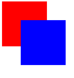
</html>z-index定位层级:
1. 默认的层级为0
2. 嵌套时候的层级问题
决定哪一个块在前面:
<!DOCTYPE html>
<html lang="en">
<head>
    <meta charset="UTF-8">
    <title>Title</title>
    <style>
        #box1{
            width: 100px;
            height: 100px;
            background-color: red;
            position: absolute;
            z-index: 1;
        }
        #box2{
            width: 100px;
            height: 100px;
            background-color: blue;
            position: absolute;
            left: 50px;
            top: 50px;
            z-index: 2;
        }
    </style>
</head>
<body>
    <div id="box1"></div>
    <div id="box2"></div>
</body>
</html>
定位实现下拉菜单:
采用hover可以实现下拉菜单
<!DOCTYPE html>
<html lang="en">
<head>
    <meta charset="UTF-8">
    <title>Title</title>
    <style>
        *{
            margin: 0;
            padding: 0;
        }
        ul{
            list-style: none;
        }
        #menu{
            width: 100px;
            height: 30px;
            margin: 20px auto;
            border: black solid 1px;
            position: relative;
        }
        #menu ul{
            width: 100px;
            border: 1px solid black;
            position: absolute;     /*相对于浏览器页面*/
            left: -1px;
            top: 30px;
            background-color: white;
            display: none;
        }
        p{
            text-align: center;
        }
        #menu:hover ul{
            display: block;
        }
        #menu ul li:hover{
            background-color: grey;
        }
    </style>
</head>
<body>
    <div id="menu">
        卖家中心
        <ul>
            <li>列表项1</li>
            <li>列表项2</li>
            <li>列表项3</li>
            <li>列表项4</li>
        </ul>
    </div>
    <p>测试段落测试段落测试段落测试段落测试段落</p>
</body>
</html>
定位实现居中和装饰点:
<!DOCTYPE html>
<html lang="en">
<head>
    <meta charset="UTF-8">
    <title>Title</title>
    <style>
        *{
            margin: 0;
            padding: 0;
        }
        ul{
            list-style: none;
        }
        #box1{
            width: 300px;
            height: 300px;
            border: 1px solid black;
            position: relative;
        }
        #box2{
            width: 100px;
            height: 100px;
            background-color: red;
            position: absolute;
            left: 50%;
            top: 50%;
            margin: -50px 0 0 -50px;     /*margin拉取操作*/
        }
    </style>
</head>
<body>
    <div id="box1">
        <div id="box2"></div>
    </div>
</body>
</html>
CSS添加省略号:
1. width: 必须有一个固定的宽度
2. white-space: nowrap不让内容折行
3. overflow: hidden
4. text-overflow: ellipsis
<!DOCTYPE html>
<html lang="en">
<head>
    <meta charset="UTF-8">
    <title>Title</title>
    <style>
       #box1{
           width: 200px;                 /*1. 固定宽度 */
           border: 1px solid black;
           white-space: nowrap;          /*2. 不让内容折行*/
           overflow: hidden;             /*3. 溢出隐藏 */
           text-overflow: ellipsis;      /*4. text-overflow*/
       }
    </style>
</head>
<body>
    <div id="box1">测试文字测试文字测试文字测试文字测试文字测试文字</div>
</body>
</html>
CSS精灵及好处:css sprite
是一种网页图片应用处理方式,允许将一个页面涉及到的所有零星图片都包含到一张大图中去加载
好处:
1. 可以减少图片的质量,网页的图片加载速度快
2. 减少图片的请求次数,加快网页的打开
---------------------------------------------------------------------------------------------------
CSS圆角设置:
border-radius: 设置圆角
做正圆的话写百分比即可
<!DOCTYPE html>
<html lang="en">
<head>
    <meta charset="UTF-8">
    <title>Title</title>
    <style>
       #box1{
           width: 200px;
           height: 200px;
           background-color: red;
           /*border-radius: 10px;*/     /*一般圆角   圆与四角相切*/
           /*border-radius: 50%;*/      /*正圆*/
           border-radius: 20px / 40px;  /*椭圆   椭圆长短轴*/
       }
    </style>
</head>
<body>
    <div id="box1"></div>
</body>
</html>
----------------------------------------------------------------------------------------------------------------------
原文链接: https://www.cnblogs.com/ncepubye/p/12723994.html
欢迎关注
微信关注下方公众号,第一时间获取干货硬货;公众号内回复【pdf】免费获取数百本计算机经典书籍;
也有高质量的技术群,里面有嵌入式、搜广推等BAT大佬

原创文章受到原创版权保护。转载请注明出处:https://www.ccppcoding.com/archives/396446
非原创文章文中已经注明原地址,如有侵权,联系删除
关注公众号【高性能架构探索】,第一时间获取最新文章
转载文章受原作者版权保护。转载请注明原作者出处!